
Helvetica J

NICHOLE GRONVOLD ROLLER
Helvetica: Uppercase, currently on display at the Contemporary Art Center of Peoria until Oct 22, is an exhibition of an ongoing series by the artist Travis Janssen, Associate Professor and Head of the Printmaking Program at Southern Illinois University-Carbondale.
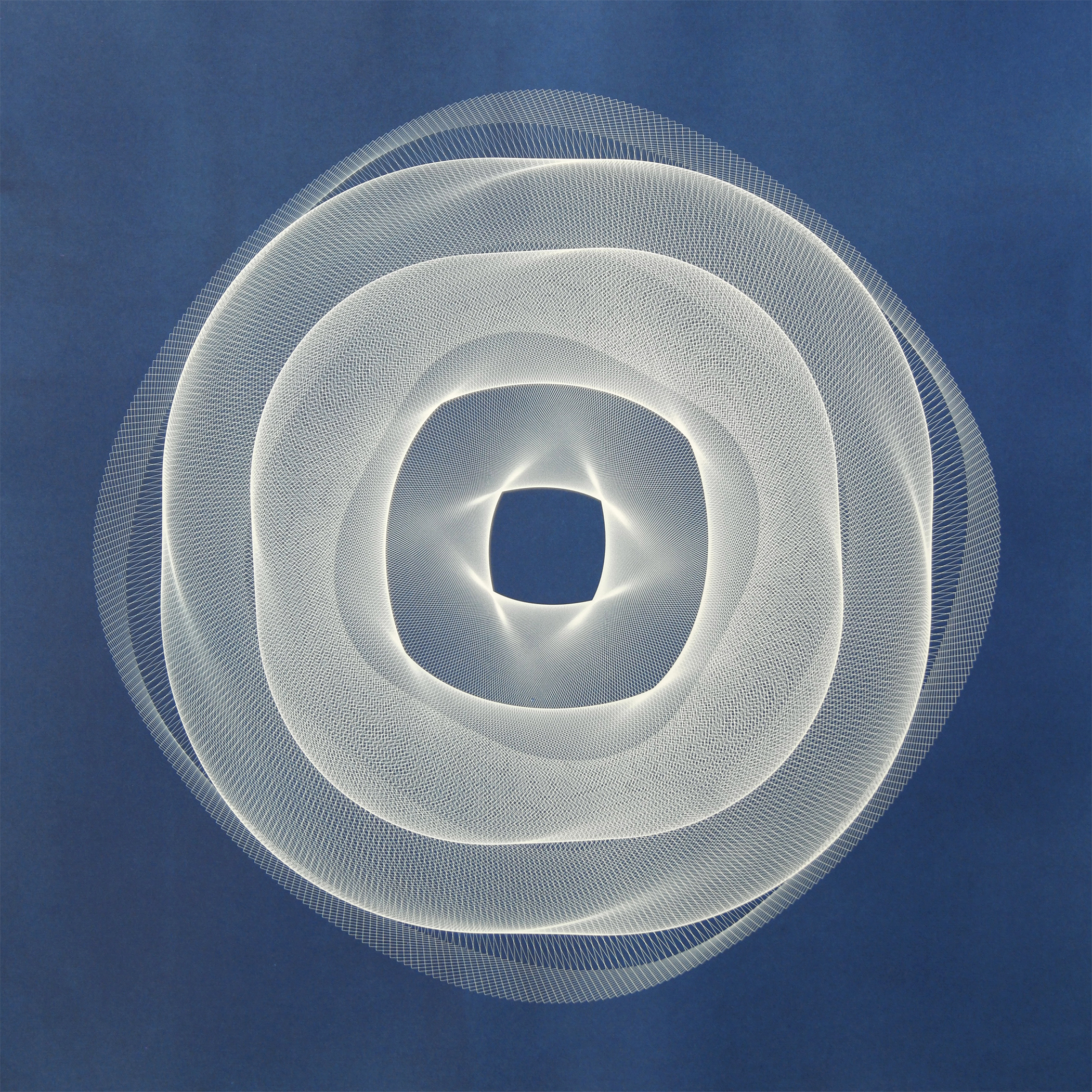
Pleasantly spaced throughout the Preston Jackson Gallery, 26 square prints and a hypnotic video installation radiates throughout the warm brick warehouse space. The grouping of uniform cyanotype prints consists of manipulated Uppercase Helvetica letterforms A-Z that possess an unexpected meditative softness to the geometric forms. The collection underscores a pairing of practicality, an accessible process with a favored typeface, merged and transformed into a transcendental experience.
Cyanotypes, introduced by scientist Sir John Herschel in 1842, became popular with architects and engineers for reproducing technical drawings — known as the blueprint. Soon after the discovery, Anna Atkins, an English botanist and photographer, used the process to create algae photograms.
Cyanotypes have continued to be an area of exploration for artists because of the material’s versatility and distinctive, brilliant, cyan-blue hue.

Travis Janssen
Trained as a fine art printmaker, Janssen is well-versed in relief and screen printing, introducing photographic techniques with ease to his artistic practice. Janssen explains that he employs “a traditional process of mixing the chemistry by hand applying it to sheets of cotton rag paper in creating cyanotypes.
“Once the cyanotype solution has dried,” Janssen describes, he exposes the “sheet to ultraviolet light, sandwiching a positive film between the sensitized paper and the light source.”
Being mindful of the human mark, Janssen reveals that he embraces and sometimes purposely introduces “a bit of variation and flaw along the way. I’m translating very mechanical drawings into cyanotypes, and adding a bit of my own hand into the process makes sense. Since the resulting prints are analog rather than digital, they are imbued with an atmospheric plane for the viewer to enter rather than what otherwise could be read as cold and sterile linework, output by a machine, lying on top of a piece of paper.”

Helvetica T
In questioning Janssen about the rationale for the chosen typeface or if he includes additional elements, the artist replied, “I’ve experimented with a number of typefaces throughout this body of work — notably Garamond, Times New Roman, and Comic Sans. I’ve settled on Helvetica for the time being since it is championed as one of the finest typefaces ever designed.”
Whether you have heard of Helvetica or not, the typeface is present wherever you look, in advertisements, publishing, and, most notably, transportation signage. Since the appearance in 1957, the letterform has become widely used by designers for its understated elegance and modern vibe; yet, it has additionally been criticized for its commonality.

Helvetica Z
Janssen takes advantage of the ubiquitous design of Helvetica, stating that “the images are made from the outlines or wireframes of the individual letters, in essence, their structures, their plans. However, I am multiplying, rotating, and convoluted the letterforms to reinvent what otherwise would be wholly familiar.”
“Helvetica Uppercase,” an exhibition built upon a history of innovation, is aligned and reassembled anew. If willing and open to possibilities, the viewer may experience a liminal space of energy, peace, and contemplation.
More information and examples of Travis Janssen’s artwork may be found at https://travisjanssen.com/
The Contemporary Art Center can be accessed at https://peoriacac.org/
1 comment for “Inland Arts | Raising Helvetica: Travis Janssen creating cyanotypes with one of the ‘finest’ fonts in the world”